Blue Parrot Painting’s Go-To Paint Colors
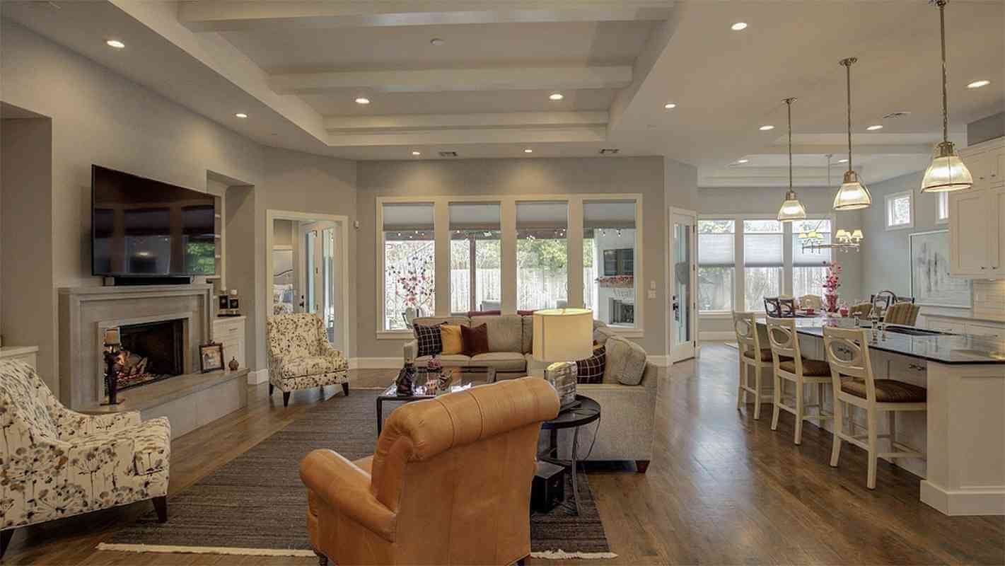
We read a lot about popular paint colors, interior designer’s go-to colors and client favorites. They’re the top-selling colors at paint stores for one reason - they work. They’re versatile. They’re neutral. These tried and true colors withstand the test of time. Some of them have been around for many years and are still great choices today.
From Sherwin-Williams: Pure White - a neutral white, at the middle of cool and warm, Tricorn Black - a true black, great for contrast. Perfect Greige - what it says, the perfect mix of gray and beige. Accessible Beige - beige with a touch of gray. Agreeable Gray - a lighter gray we recommend the most and everyone loves. It just works!
Honorable mentions from Sherwin-Williams are Sea Salt - a green with a touch of gray, but depending upon the lighting, it can be green-blue. Icelandic - a lovely light blue, or Blissful Blue - bluer, brighter, but still light, perfect for farmhouse and country decor. Passive - a gray with no undertones. We’re considering it for our living/dining room next time we paint. In the beige department, view Softer Tan, Natural Linen, and Kilim Beige. If you are painting woodwork, we recommend Evergreen.
From Benjamin Moore, take a look at White Dove - by far one of the best whites, on the warm side but only with a touch of yellow. Chantilly Lace - clean white. Edgecomb Gray - another griege, Gray Owl - tricky, has green undertones but can go blue. Revere Pewter - a taupe-ish gray, Stonington Gray - the original stormy gray. (Ben Moore says grays are the ultimate neutrals.) Muslin and Putnam Ivory - both nice tans, Hawthorne Yellow - uplifting, but not too bright, Palladian Blue - beautiful, actually from their green family. Old Navy - surprisingly calming. Linen White - a delicate ivory color.
Keep in mind your local paint store should be able to mix just about any color from other paint brands.
